Client Project · Live

Norco Auto Detailing & Tint

Auto Detailing & Window Tint · Norco, California
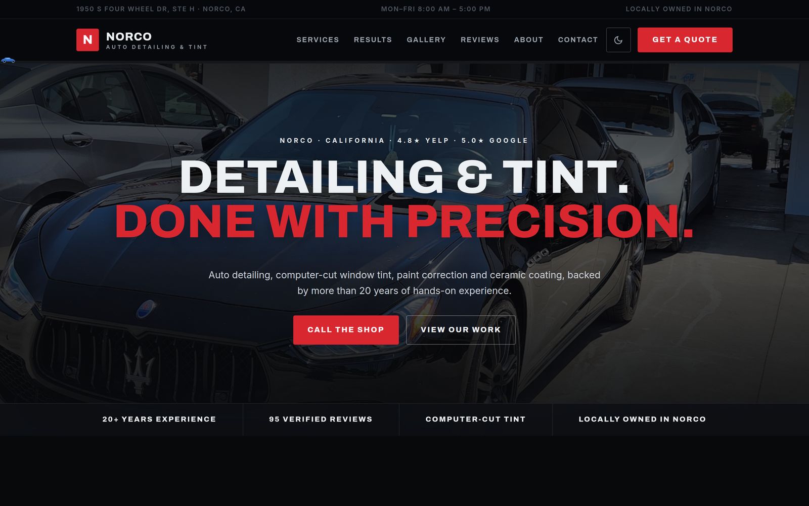
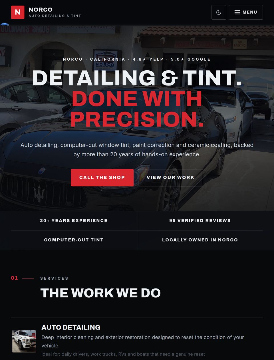
Norco Auto Detailing & Tint homepage — dark hero over a detailed black car with the headline Detailing & Tint, Done with Precision
The same homepage on a tablet
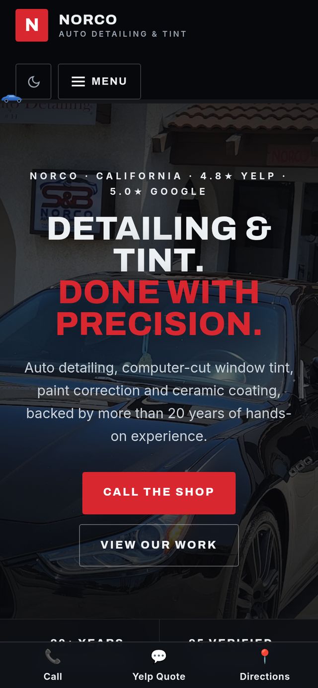
The same homepage on a phone, with call and directions shortcuts pinned to the bottom
Norco Auto Detailing & Tint homepage — dark hero over a detailed black car with the headline Detailing & Tint, Done with Precision

A detailing and tint shop with more than 20 years in Norco, a strong Yelp reputation — and no website. We built a nine-page site around what already made the shop trusted: its real reviews, real work, and a straight local voice, with a quote flow that lets customers call, text, or request pricing in three steps.

Visit the live site ↗

Key decisions

  1. Lead with proof — live Google and Yelp ratings, real shop photography, and a filterable gallery of actual work.
  2. Design for the parking lot — a sticky call/text/directions bar and 3-step quote form built for phones first.
  3. Sell the craft — before/after sliders and per-service pages for tint, paint correction, and ceramic coating.
Read Full Project Thinking

Challenge

The shop's reputation lived entirely on Yelp and word of mouth — two decades of work with no home of its own. Customers searching for tint or detailing in Norco found competitors with websites first.

Approach

Put the proof the shop already earned front and center: live Google and Yelp ratings, real photographs of real cars, and per-service pages that answer what customers actually ask before they call.

Design

A near-black foundation with warm light contrast sections, sharp tight-tracked type, and the shop's red as the single accent — automotive and serious, without stock supercars or carbon-fiber clichés.

Build

A fast, static-first build: filterable gallery with lightbox, draggable before/after sliders, a rotating review carousel, and a three-step quote form — all keyboard-accessible and reduced-motion friendly.

Structure

  • Home
  • Detailing
  • Window Tint
  • Paint Correction
  • Ceramic Coating
  • Gallery
  • Reviews
  • About
  • Contact

Conversion

  • Sticky call / text / directions bar on mobile
  • 3-step quote form with progress bar
  • Live Google and Yelp ratings in the hero
  • Before/after proof on every service page
Concept Study

Summit Exterior Co.

Home services

A focused digital presence built around craftsmanship, trust, and a clear quote process.

Key decisions

  1. Make quote requests the primary action
  2. Bring licensing and warranty information forward
  3. Organize services around customer needs
Read Full Project Thinking

Challenge

Many contractor websites rely on similar service lists, stock photography, and broad claims. The opportunity was to create a more considered experience that establishes trust quickly.

Approach

The structure places proof, services, and project information where customers naturally look for them. The quote process remains easy to begin while collecting enough detail to be useful.

Design

Warm neutrals, deep slate, and a restrained accent color create a practical visual system with a more considered finish.

Build

A responsive, performance-conscious build with individual service pages, local-search structure, and a focused lead form.

Structure

  • Home
  • Roofing
  • Siding and Exteriors
  • Service Area
  • Process
  • Request a Quote

Conversion

  • Persistent quote action
  • Visible licensing and insurance
  • Project-specific form questions
  • Tap-to-call on mobile

Transformation

The revised direction improves hierarchy, proof, and the path to requesting a quote.

Concept Transformation
Redesign
Original
Message
A specific promise about quality and turnaround replaces a general introduction.
Action
One persistent quote request replaces competing links.
Trust
Licensing, insurance, and warranty information move above the fold.
Concept Study

Calder & Voss

Professional services

A restrained legal website designed to communicate experience, clarity, and discretion.

Key decisions

  1. Use consultation scheduling as the main action
  2. Organize practice areas around client needs
  3. Reinforce privacy throughout the inquiry process
Read Full Project Thinking

Challenge

Professional-service websites often become dense, formal, and difficult to navigate. The goal was to communicate authority without creating distance.

Approach

Clear language, focused practice pages, and a direct consultation path help visitors understand the firm and decide what to do next.

Design

Warm ivory, near-black, and restrained blue create a composed editorial system.

Build

Responsive, accessible pages with structured service content and a privacy-conscious consultation form.

Structure

  • Home
  • Practice Areas
  • Attorneys
  • Approach
  • Insights
  • Schedule a Consultation

Conversion

  • One consultation action
  • Focused practice pages
  • Privacy reassurance
  • Clear process expectations

Transformation

The revised direction improves clarity, navigation, and confidence throughout the consultation journey.

Concept Transformation
Redesign
Original
Hierarchy
One clear headline and supporting statement replace competing taglines.
Typography
A restrained editorial system raises perceived seniority.
Navigation
Practice-first structure replaces a generic page list.
Demo Build

Fieldline Goods

Consumer and ecommerce

A product experience designed to strengthen the brand while keeping the path to purchase simple.

Key decisions

  1. Lead with a focused product selection
  2. Place shipping and guarantee details near purchase actions
  3. Use the brand story to support perceived value
Read Full Project Thinking

Challenge

Many emerging ecommerce brands begin with familiar storefront themes that make products feel interchangeable.

Approach

A focused catalog, editorial product storytelling, and clear purchase information create a stronger and more intentional experience.

Design

A restrained palette allows product imagery and typography to establish the identity.

Build

Reusable storefront components, optimized media, persistent cart access, and flexible integration points.

Structure

  • Home
  • Shop
  • Product Detail
  • About
  • Shipping and Returns

Conversion

  • Focused product selection
  • Visible shipping information
  • Reviews near purchase actions
  • Persistent cart access

Transformation

The revised direction creates a stronger identity and a clearer path from discovery to purchase.

Joma Labs Demo Build
Redesign
Original
Brand
The story and standards open the site instead of a generic carousel.
Products
A curated selection replaces a wall of thumbnails.
Confidence
Shipping, returns, and guarantees sit beside the buy action.

Have a project in mind?

Share the business, the current website, and what needs to change.